It is one of the most consequential color decisions in any interior painting project, and it gets made in about thirty seconds by most homeowners. White trim or trim that matches the walls? The instinct is usually white — it’s what most homes have, it’s what design magazines show, and it seems like the safe choice that can’t really go wrong. So white trim gets specified, the project gets completed, and the room looks fine. Sometimes it looks exactly right. Sometimes something feels slightly off without a clear reason why.
The reason it sometimes feels off is that the white-vs.-matched trim decision is not a neutral aesthetic preference with no spatial consequences. It is a design choice that actively changes how a room reads — how tall the walls appear, how heavy or light the architecture feels, whether the room seems cohesive or compartmentalized, and whether the specific style of home it’s in looks intentional or slightly mismatched. Understanding the mechanics behind each approach gives Tyler, Lindale, Whitehouse, Flint, and Bullard homeowners a framework for making this decision based on what their specific room actually needs rather than on default habit.
What White Trim Does to a Room — and Why It Works So Reliably
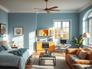
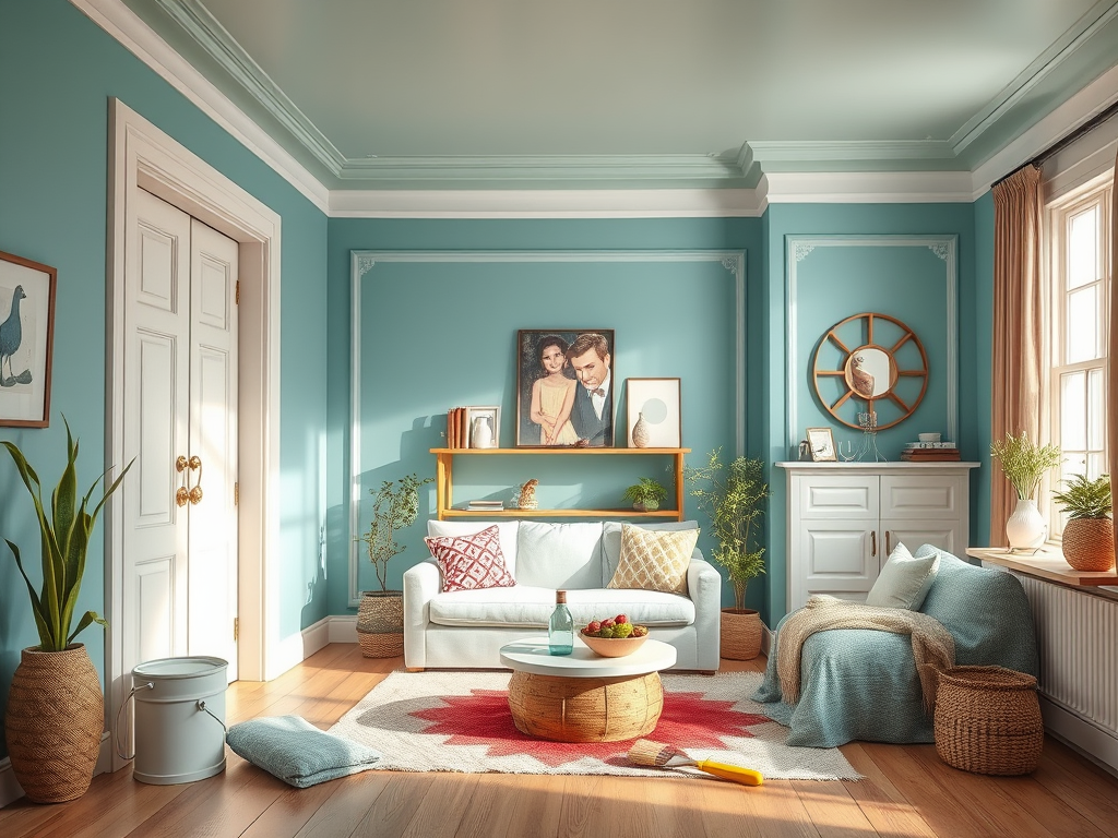
White trim on colored walls is the dominant convention in American residential interiors for a reason that goes beyond fashion: it works reliably across a wide range of room types, wall colors, and architectural styles because its visual effect is consistent and predictable. When trim is painted white against a colored wall, it creates high contrast at every architectural edge — the baseboard line, the door and window casings, the crown molding at the ceiling junction. That contrast makes the room’s architecture legible. Every edge registers clearly as a separate element, and the eye reads the room’s structure as defined and precise.
This architectural legibility is most valuable in rooms where the trim detail is a genuine design feature worth celebrating. In Tyler homes with substantial crown molding profiles, detailed door casings, or wainscoting that carries visual weight down the lower half of the wall, white paint makes those elements visible and prominent — which is exactly the point of having invested in them. The contrast draws attention to the craftsmanship, and the room reads as carefully detailed rather than generically finished.
White trim also performs a specific spatial function in rooms where the wall color is deep or saturated. A dark navy wall with white trim, a deep forest green with white baseboards, a rich terracotta with white casings — in each of these combinations, the white trim creates a visual reset at the room’s architectural edges that prevents the deep color from feeling oppressive or cave-like. The white acts as a breathing point, separating the color into defined planes rather than letting it flood the entire visual field without interruption.
The limitation of white trim is equally specific: it can make low ceilings feel lower, it emphasizes rooms that are architecturally simple in ways that may not flatter them, and in the warm, intense natural light that East Texas delivers through south and west-facing windows, a crisp bright white trim against a soft wall color can read as harsh rather than clean — the contrast level that looks elegant in soft northern light can look severe under the direct sun angles that Tyler interiors experience for much of the year.
What Matching Trim to the Wall Color Actually Accomplishes
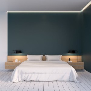
The alternative — painting trim the same color as the walls, or a closely related tone from the same color family — produces a set of spatial effects that are distinct from white trim in almost every way. When trim disappears into the wall color, the room’s architectural skeleton becomes invisible, and what remains is a continuous color field that fills the entire space without interruption. The eye travels across the room without stopping at every baseboard and door casing, and the space reads as larger, more open, and more contemporary than the same room with contrasting white trim.
This approach has become significantly more common in East Texas homes over the past decade, and its appeal is not purely aesthetic. In rooms with modest trim profiles — the flat or simple colonial casings and baseboards common in many production-built Tyler and Lindale homes from the 1990s and 2000s — white paint actually draws attention to how simple the trim is. White trim is most flattering when the profiles it highlights are worth highlighting. Simple, flat trim highlighted by white contrast reads as thin and builder-grade. The same trim painted to match the walls simply disappears, and the room looks more finished rather than less, because the eye isn’t being directed toward a detail that doesn’t reward the attention.
Matching trim to walls also works exceptionally well with deep, immersive wall colors where the goal is to create an enveloping atmosphere rather than a clearly bounded architectural experience. A home office painted in a rich, saturated blue-green from floor to ceiling, trim included, creates a focused, contained environment that the same color with white trim interrupts at every edge. A dining room with deeply saturated walls and matched trim creates the intimate, candlelit atmosphere that restaurants spend significant design budgets trying to achieve. In these applications, the matched trim is not a compromise or a shortcut — it is the correct design decision for the specific effect being created.
How East Texas Light Should Influence the Choice
Paint color decisions that work in one regional market don’t always translate to another, and the trim color decision is no exception. East Texas receives some of the most intense and consistent natural light of any market in the country — Smith County averages over 230 sunny days per year, and the sun angle during the long summer months means south and west-facing walls receive direct light for many hours each day. That light quality is warm, bright, and relentlessly revealing of surface contrast.
In a Tyler or Lindale home with significant south or west-facing window exposure, bright white trim creates a high-contrast edge condition that is amplified by the warm afternoon light hitting the wall at a shallow angle. The contrast between a soft wall color and crisp white trim looks considered and elegant under the diffuse light of a cloudy day or the balanced morning light of a north-facing room. Under direct Texas afternoon sun, the same combination can read as jarring — the white pops intensely in a way that feels less like intentional architecture and more like something bright interrupting the wall surface.
For Tyler homes with significant west-facing exposure in living rooms, family rooms, and bedrooms where afternoon sun is unavoidable, an off-white or warm white trim rather than a pure crisp white often produces better visual results. The warm-white trim maintains the contrast that gives white trim its architectural clarity while reducing the intensity of that contrast under warm afternoon light. Alternatively, rooms with intense direct sun exposure that use a wall color on the warmer end of the spectrum — warm neutrals, taupes, terracottas — are strong candidates for matched or near-matched trim, because the high ambient warmth of the space makes hard white contrast work against the room’s overall atmosphere rather than complementing it.
The Resale Consideration That Tyler Homeowners Should Factor In
For homeowners who are planning eventually to sell their Tyler or East Texas property, the trim color decision carries a practical dimension beyond personal aesthetics: how does each approach read to prospective buyers who will walk through the home without the benefit of knowing the design intention behind it?
White trim is the convention that most buyers expect and recognize as normal, and rooms with white trim read as neutral and move-in ready to the broadest possible audience. This doesn’t mean matched trim is a liability — in the right room with the right execution, matched trim reads as sophisticated and intentional to buyers who recognize it as a deliberate design choice. But matched trim that was done carelessly, without adequate product selection or technique, can read as cut-rate to buyers who associate it with a painter who didn’t take the time to do white trim properly.
The resale consideration essentially reinforces the quality-of-execution argument: either approach works for resale if it’s done well, and either approach can hurt resale if it’s done carelessly. Crisp, clean white trim on well-prepared surfaces with sharp cut lines reads as quality workmanship. Matched trim applied with appropriate products to a clean, primed surface with consistent sheen reads as intentional design. The execution standard is the variable that determines resale impact, not the specific color choice.
Navigating the Decision When You Have Multiple Connected Rooms
In Tyler and East Texas homes with open floor plans or strongly connected rooms — the kitchen-to-dining-to-family-room sequences that characterize most production homes built in Smith County over the last twenty years — the trim color decision carries an additional layer of consideration: consistency across the connected space.
Changing trim color between connected rooms that are visible from a single vantage point creates a visual discontinuity that is difficult to explain and harder to resolve after the fact. If the living room has white trim and the adjacent dining area has matched trim and both spaces are visible from the entry, the transition reads as inconsistent rather than deliberate. The practical guidance for open-plan East Texas homes is to commit to a single trim color strategy for any areas that are visually connected, even if the wall colors change between zones. White trim can run continuously through multiple connected spaces with different wall colors, providing a unifying architectural element that ties the spaces together. Matched trim in an open plan requires either a single consistent wall color across the connected spaces or a very deliberate tonal relationship between the matched trim colors in adjacent zones.
Let Quality Coats Help You Make the Right Call for Your Home
The trim color decision is one of those choices that looks straightforward until you’re living with the result and realizing it changed the room in ways you didn’t anticipate. At Quality Coats Painting, we help homeowners throughout Tyler, Lindale, Whitehouse, Flint, and Bullard work through exactly these decisions before paint is committed to any surface — evaluating the room’s proportions, light conditions, architectural detail quality, and how connected spaces interact — so that the finished result looks the way you were imagining rather than like a choice that seemed fine until the afternoon light hit the wall. If you’re planning an interior painting project and want professional guidance on trim color, product selection, and execution that delivers results you’ll still be happy with years from now, contact our team today for your free estimate and let’s make every surface in your home work together the way it should.